Entry · Ref GAQ6JLCE
What Makes Great Web Design Stand Out in Competitive Markets
- Posted
- 2026-11-13
- Last amended
- 2026-11-13
- Account
- @smartweb803
Great web design is rarely loud for the sake of being loud. The sites that win in crowded industries tend to do something harder and far more valuable. They make the right things feel obvious. They guide attention without feeling manipulative. They create trust before a sales call, before a store visit, before a quote request, and often before a prospect has even decided what they are looking for.
That matters more in competitive markets than almost anywhere else. When ten companies offer similar services, use similar language, and promise similar results, design becomes the difference between being noticed and being ignored. Not because it is decorative, but because it shapes how people judge credibility, speed, competence, and fit. Visitors make those judgments fast. If a website feels dated, confusing, thin, or generic, they do not always analyze why. They simply leave.
I have seen this play out in industries where margins are tight and attention is expensive, from local service businesses to regional professional firms. The companies that get the best return from web design are not always the biggest spenders. They are the ones that understand a simple truth: good design is not an art project sitting on top of a business. It is part of the business.
Standing out starts with clarity, not novelty
A common mistake in competitive markets is chasing originality before clarity. A company wants a homepage that looks unlike anything a competitor has. That instinct is understandable, but it often leads to confusion. If a visitor lands on the site and cannot tell what the business does, who it serves, and what to do next within a few seconds, the design has already failed, no matter how impressive it looks in a portfolio.
The best sites usually make a strong first impression with disciplined messaging. The headline is specific. The images support the offer instead of distracting from it. The page layout creates a clear visual path. Buttons are easy to spot. Contact options are placed where people actually look for them. This sounds basic, yet it is where many businesses lose ground.
I once reviewed two websites for companies in the same home services niche. Both had competent branding, decent photography, and similar pricing. One site opened with a vague slogan and a cinematic banner video that slowed everything down. The other opened with a sharp value proposition, a service area mention, social proof, and a quote button visible without scrolling. Guess which one generated more leads. It was not close.
In saturated categories, clarity feels premium because so many sites still make people work too hard.
Trust is designed long before it is stated
Businesses often talk about trust as if it lives in testimonials alone. Testimonials matter, but trust starts earlier. It begins with whether a site feels current, whether the typography is readable, whether the mobile version works smoothly, whether the forms seem secure, whether the contact information is easy to verify, and whether the company appears established enough to be accountable.
This is where great web design quietly earns its keep. It reduces friction and raises confidence at the same time.
A well-designed site signals that the business pays attention. It suggests order, process, and professionalism. That may sound intangible, but prospects use these signals constantly. A law firm site with cramped spacing, stock photos from another decade, and inconsistent colors does not simply look unattractive. It raises doubts about how carefully that firm handles details. A local contractor site with broken links and confusing navigation does not only create annoyance. It makes people wonder what communication will be like after they sign the proposal.
Trust compounds through small decisions. Clean hierarchy. Consistent branding. Real team photos when possible. Thoughtful use of white space. Clear location and service area information. Straightforward explanations of what happens next. These choices tell visitors, in effect, you are in capable hands.
The strongest websites know exactly who they are for
In highly competitive markets, broad messaging usually weakens a site. Businesses want to appeal to everyone because narrowing the message feels risky. In practice, vague sites tend to convert worse because they do not make any one audience feel understood.
Great web design stands out when it reflects a real strategic choice about the customer. That choice shows up in both content and presentation. A website design for small business looks different when the owner depends on local trust, repeat business, and a limited marketing budget than it does for a venture-backed software company trying to impress investors. The navigation, the proof points, the calls to action, even the pace of the page should align with how that audience buys.
For small businesses, especially local ones, visitors often want a short list of assurances before they take the next step. Are you nearby? Have you done this before? Can I reach a real person? Are your prices or process explained clearly enough that I will not waste time contacting you? The best websites answer those questions almost immediately.
That is one reason tailored web design consistently outperforms templated thinking. A generic framework might save time, but it rarely captures the actual buying psychology of the audience. Competitive markets punish generic decisions.
Visual quality matters, but only when it supports the sale
There is no point pretending aesthetics do not matter. They do. People respond to proportion, color, imagery, and motion. Good visual design can make a business feel established, approachable, premium, or technically sharp. It can shift perception in a matter of seconds.
But aesthetics alone do web design not separate winning sites from average ones. I have seen beautiful websites underperform because they were too clever, too sparse, or too detached from customer intent. The layout won design awards and lost business.
What works in competitive markets is design that uses visual polish in service of commercial goals. That means attractive pages that still prioritize readability. Motion that adds energy without slowing performance. Brand personality that strengthens recognition without obscuring the offer. Premium cues that justify pricing without making the business feel inaccessible.
One of the best redesigns I worked on involved reducing visual complexity, not adding to it. The original site had multiple font styles, layered animations, and pages full of competing color accents. It looked ambitious, but visitors were dropping off quickly. The revised version used fewer elements with more discipline. The result felt more confident, not less creative. Time on page improved, contact form submissions rose, and the sales team reported that leads arrived with a better understanding of the offer.
Strong design does not shout. It directs.
Speed and mobile experience are now part of brand perception
Years ago, companies could treat performance as a technical issue that sat in a separate bucket from design. That line is gone. If a site is slow, jumpy, or awkward on a phone, users experience that as part of the brand.
This matters even more in competitive markets because people are often comparing several options in the same sitting. They are opening tabs, checking reviews, glancing at pricing pages, and looking for reasons to eliminate choices quickly. A site that loads slowly or breaks on mobile creates an easy reason to move on.
The businesses that stand out do not just look polished on a desktop monitor during a presentation. They work cleanly in real life, on a phone in a parking lot, during a lunch break, with one hand, low patience, and five open tabs. That is the test that counts.
For local companies, this is especially important. Someone searching for web design the woodlands, a roofer near their neighborhood, or a family law attorney in their area may decide within minutes whom to contact. If your mobile experience forces pinching, hunting, or waiting, the competitor with the simpler site wins the click.
Performance also influences search visibility, user satisfaction, and ad efficiency. A faster, more usable site often lowers the cost of acquiring each lead because fewer visitors leak out of the funnel. That is not just a design win. It is an operations win.
Great design aligns with how people decide
Most websites are built around what the business wants to say. Great websites are built around what the visitor needs to decide.
That sounds subtle, but it changes everything. Instead of filling pages with internal language, the site organizes information in the order people naturally look for it. Instead of assuming every visitor wants the same detail, it creates layers. A quick summary for the skimmer. Deeper proof for the cautious buyer. Strong calls to action for the ready prospect.
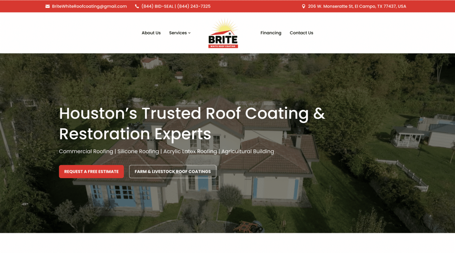
Design supports that progression. Good pages create momentum. They anticipate objections before those objections stall the decision. They place social proof near points of hesitation. They explain process before the user has to ask. They simplify forms so the next step feels manageable.
Here is where many businesses in crowded markets miss opportunities. They invest in driving traffic, then send visitors to pages that do not match buying intent. A person looking for immediate service sees a wall of abstract brand copy. A careful B2B buyer sees a stylish homepage with no meaningful case studies. A local customer trying to verify service area cannot find it without digging. Design has to respect the decision-making context.
The strongest websites usually do a few things exceptionally well:
- They explain the offer in plain language.
- They prove credibility with specific, visible evidence.
- They remove distractions that compete with the primary action.
- They make contact easy from any major page.
- They preserve consistency from ad click or search result to landing page.
Those are not glamorous ideas, but they win business every week.
Local competition raises the bar in a different way
National brands compete for scale. Local businesses compete for trust density. They are often selling to people who have several viable options nearby and a strong preference for convenience, familiarity, and responsiveness. In that environment, design has to do more than look modern. It has to feel rooted and credible.
That is where regional understanding can make a big difference. A company offering web design the woodlands, for example, should not present itself as a faceless service that could be anywhere. It should reflect local knowledge, local expectations, and the realities of the businesses it serves. That might mean featuring recognizable community context, speaking directly to local service businesses, or highlighting response times and support in ways that matter to owners who operate in that area.
People notice when a site feels generic. They also notice when it feels tuned to their environment. For a small business, that local relevance can be the edge that turns a comparison shopper into a lead.
I have seen local businesses improve conversion simply by making their websites more geographically legible. They added specific service areas, project photos from nearby communities, stronger location signals, and copy that reflected the kinds of concerns local customers actually raised on calls. None of that was flashy. All of it made the site feel more trustworthy.
Copy and design either reinforce each other or sabotage each other
It is impossible to talk seriously about great web design without talking about words. A beautifully designed page with weak copy is like a well-staged storefront with no one inside who can explain the product. The visual layer can attract attention, but it cannot carry the full burden of persuasion.
In competitive markets, copy needs to do several jobs at once. It has to be clear, differentiated, credible, and easy to scan. It should sound like a real business with a point of view, not like a committee trying not to offend anyone. Design then amplifies that message by controlling how it is encountered.
When design and copy are developed together, pages feel coherent. Headings set up the next visual section. Supporting text answers obvious questions without overwhelming the reader. Buttons use language that reflects intent. Proof elements appear exactly where doubt might surface. The whole experience gains rhythm.
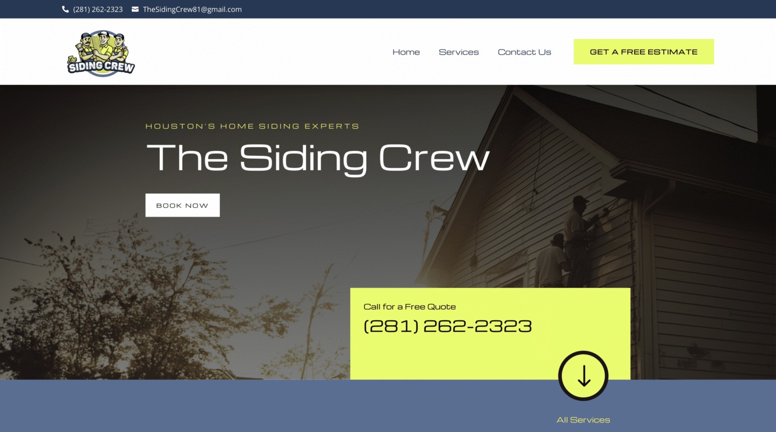
When they are developed separately, you often get the opposite. Strong visuals paired with vague headlines. Dense text crammed into layouts not built to support reading. Calls to action that feel abrupt because nothing before them built confidence. These problems are common on rushed projects, especially when businesses treat web design as a finishing layer added after strategy is done.
The sites that stand out feel integrated. You can sense that someone made decisions with the customer journey in mind.
Differentiation is often found in restraint
A lot of businesses assume standing out means adding more. More sections. More motion. More claims. More color. More words. More offers. In practice, strong differentiation often comes from editing.
When a market is crowded, visitors are overwhelmed by sameness and noise. A site that knows what not to say can feel sharper than one trying to cover every possible angle. Restraint creates confidence. It suggests the business understands its own value well enough not to overexplain or overdecorate.
This does not mean minimalism for its own sake. It means deliberate prioritization. Highlight the services that drive the business. Put the strongest proof where it matters most. Trim navigation options that dilute attention. Use fewer visual patterns, but use them consistently. Say one thing clearly before saying five things adequately.
I have watched redesigns improve performance simply because the new version stopped competing with itself. Fewer buttons on the homepage. Fewer mixed messages in the hero section. Cleaner service pages with one obvious next step. Users responded because the site respected their time.
Competitive markets reward businesses that make decision-making easier.
Great websites are built to evolve, not just launch
One reason some businesses fall behind after a redesign is that they treat launch day as the finish line. The site goes live, everyone celebrates for a week, then nothing changes for two years. Meanwhile competitors test offers, update proof, improve page speed, refine forms, and add content that reflects what customers are actually asking.
The best web design holds up because it is not frozen. It is structured for iteration. Pages can be updated without breaking visual consistency. Conversion paths can be measured. Messaging can be sharpened as the business learns more. New case studies and FAQs can be added where they support the sales process.
This matters for website design for small business more than many owners realize. Small businesses do not always have the luxury of wasting months on a total rebuild every time the market shifts. They need a site that can grow with them, support campaigns, and reflect operational reality without becoming a technical mess.
A practical redesign should leave a business with more control, not less. If every update requires developer intervention, the site may look good at launch but become stale quickly. In competitive markets, stale is expensive.
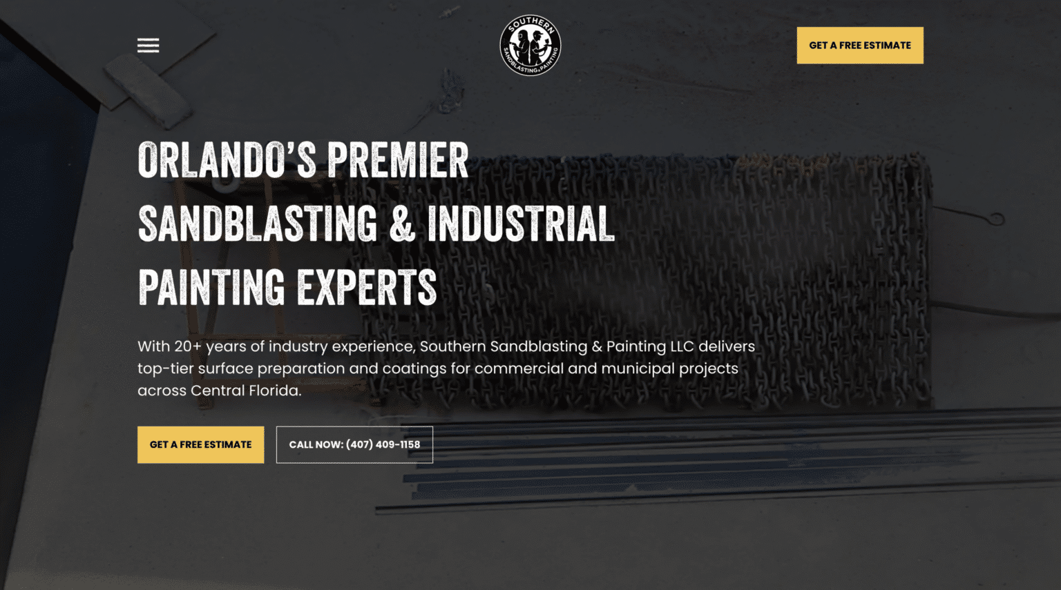
The real measure is business performance
A website can stand out visually and still underperform. It can also look modest and quietly outperform more expensive competitors. That is why the real test of web design is not whether people compliment the homepage. It is whether the site helps the business win.
That winning can show up in different ways. More qualified leads. Better conversion rates from the same traffic. Shorter sales cycles because prospects arrive more informed. Higher close rates because trust was built earlier. Stronger local visibility. Fewer abandoned forms. Better engagement from mobile users. More repeat visits from returning customers.
Design influences all of these outcomes because it shapes behavior. It determines what people notice, what they understand, what they believe, and what they do next.
If a business is serious about competing, it should ask harder questions than, do we like how the site looks? Better questions include these:
- Can a first-time visitor understand our value fast?
- Does the site reflect the expectations of our actual buyers?
- Are we making trust easy to establish?
- Is the mobile experience good enough to compete right now?
- Do our pages help people decide, or just give them information?
Those questions get much closer to what separates average web presence from a site that becomes a real asset.
Why the best design often feels inevitable
When web design is done exceptionally well, people do not always describe it in technical terms. They say the site felt easy. Professional. Clear. Credible. They found what they needed. They knew what to do next. They felt comfortable reaching out.
That reaction is not accidental. It is the product of strategy, judgment, refinement, and empathy for the buyer. In crowded markets, those qualities matter far more than trend chasing.
Great web design stands out because it removes doubt. It gives shape to the brand, direction to the message, and momentum to the buying process. It helps a business look like the obvious choice before the first conversation happens.
That is the real advantage. Not a prettier website for its own sake, but a sharper competitive position built page by page, decision by decision, until the market can feel the difference.
Scalable Websites
Website design for contractors and small businesses
Based in Montgomery, TX, serving Montgomery County and greater Houston
Phone: (832) 979-2478
Website: scalablewebsites.com
Hours: Monday to Friday, 8 AM to 5 PM
Scalable Websites builds and manages mobile-first websites for contractors and small businesses on simple monthly plans, with hosting, security and unlimited updates included. Find us on Google.